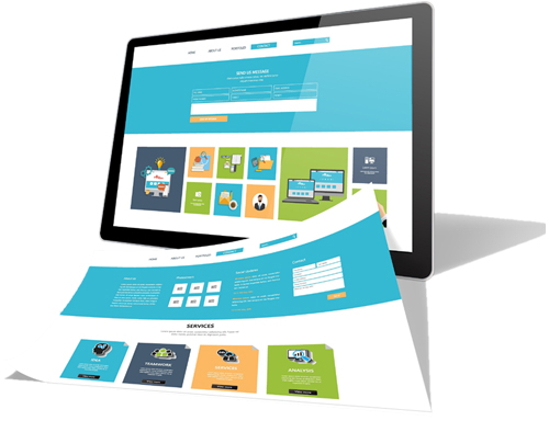
Why Responsive Web Design Matters for Your Business
In today's digital landscape, where users access websites from a myriad of devices—smartphones, tablets, laptops, and desktops—ensuring a seamless user experience across all platforms is paramount. Responsive Web Design (RWD) addresses this need by adapting website layouts to various screen sizes and orientations, enhancing usability and satisfaction.
What is Responsive Web Design?
Responsive Web Design is an approach to web development that ensures a website's layout and content adjust fluidly to the screen size and resolution of the device it's viewed on. This adaptability is achieved through techniques such as fluid grids, flexible images, and CSS3 media queries, allowing for optimal viewing experiences on any device.
Benefits of Responsive Web Design
- Enhanced User Experience
A responsive website provides a consistent and intuitive user experience across all devices, reducing the need for zooming or horizontal scrolling. This improved usability encourages visitors to stay longer and engage more with your content. - Improved SEO Performance
Search engines like Google prioritize mobile-friendly websites in their rankings. Responsive design ensures your site meets these criteria, potentially boosting your visibility in search results. - Cost and Time Efficiency
Maintaining a single responsive website is more efficient than managing separate versions for desktop and mobile. This unified approach simplifies updates and reduces development costs. - Increased Conversion Rates
By providing a seamless experience across devices, responsive design can lead to higher conversion rates, as users are more likely to complete desired actions without frustration.
eBuild Web Solutions: Your Partner in Responsive Web Design
At eBuild Web Solutions, we specialize in crafting responsive websites tailored to your business needs. Our team employs the latest technologies and best practices to ensure your website delivers optimal performance and user experience on all devices.
Our Responsive Web Design Services Include:
- Custom Design: We create unique, brand-aligned designs that resonate with your target audience.
- Mobile-First Approach: Prioritizing mobile usability to cater to the growing number of mobile users.
- SEO Optimization: Implementing SEO best practices to enhance your site's visibility in search engine results.
- Performance Optimization: Ensuring fast load times and smooth navigation to keep users engaged.
- Ongoing Support: Providing continuous maintenance and updates to keep your website current and secure.
Why Choose eBuild Web Solutions?
- Expertise: Our experienced team stays abreast of the latest web design trends and technologies.
- Client-Centric Approach: We collaborate closely with you to understand your goals and deliver solutions that meet your specific requirements.
- Proven Results: Our responsive designs have helped numerous clients improve user engagement and achieve their business objectives.
Get Started with eBuild Web Solutions
Ready to enhance your online presence with a responsive website? Contact eBuild Web Solutions today to discuss your project and discover how we can help you reach your digital goals. By integrating responsive design into your website, you not only improve user experience but also position your business for greater success in the digital marketplace.